
Blog
Prospectus Printing Services: Creating Enrollment-Driving Institutional Publications

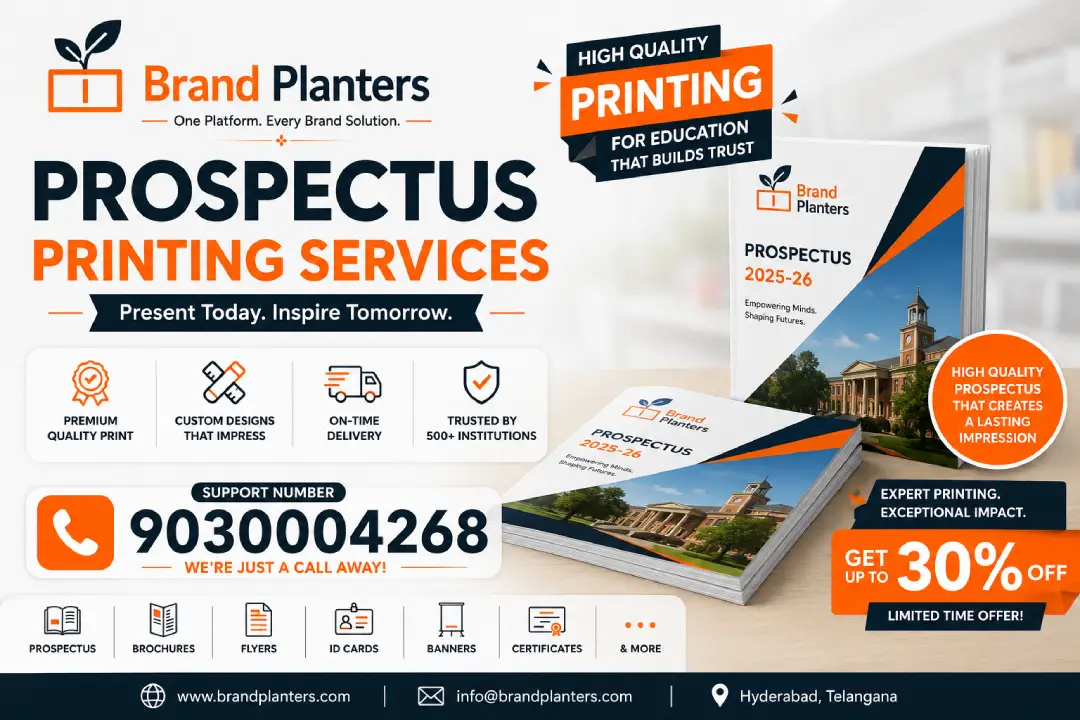
In the high-stakes arena of educational recruitment, institutions deploy armies of counselors, invest heavily in digital campaigns, and orchestrate elaborate campus tours. Yet, one physical artifact often does the heavy lifting when parents and students make their final decision: the institutional prospectus.
What is Prospectus Printing Services?
In the calculus of institutional marketing, the prospectus is often treated as a line item to minimize. This perspective is fundamentally flawed. A prospectus is not an operational cost—it is a capital investment in enrollment growth, brand equity, and institutional reputation.
Consider the mathematics. A premium prospectus costing ₹150 per unit distributed to 5,000 serious inquiries requires an investment of ₹7,50,000. If that prospectus converts even 50 additional students at an average fee of ₹2,00,000 per annum, the return exceeds ₹1 crore annually. The prospectus does not cost money—it makes money.
The question, therefore, is not whether to invest in quality prospectus printing, but whether your current prospectus is working as hard as it should to convert interest into enrollment, and skepticism into trust.
It is not merely a document production exercise. It is strategic enrollment marketing captured in physical form. For educational institutions across India—from engineering colleges in Hyderabad to liberal arts universities in Pune, from business schools in Mumbai to medical colleges in Chennai—the quality of prospectus printing directly correlates with perceived institutional quality.
At Brand Planters, we have witnessed firsthand how a meticulously printed prospectus transforms inquiry into application, and application into enrollment. This guide explores what separates ordinary prospectus printing from extraordinary, and why your choice of printing partner shapes institutional success in ways that extend far beyond the production floor.
Why the Prospectus Remains Indispensable in Digital-First Recruitment
The skepticism surrounding printed prospectuses is understandable. Institutions now maintain sophisticated websites, virtual tour platforms, social media presence, and email nurture sequences. Why invest in physical printing when digital distribution is instantaneous and virtually free?
The answer lies in cognitive psychology and consumer behavior patterns specific to educational decision-making in India.
The High-Involvement Decision Context
Choosing a college or school is not an impulse purchase. It is a high-involvement, high-stakes decision involving significant financial commitment, career trajectory implications, and emotional investment from entire families. In such contexts, consumers seek tangible evidence to validate their choices. A physical prospectus serves as that evidence—a permanent, touchable artifact that signals institutional substance and stability.
Digital content is ephemeral. A website can be redesigned overnight. A social media post disappears in a feed. A printed prospectus, however, occupies physical space in a home. It sits on coffee tables for weeks. It is reviewed repeatedly by parents, grandparents, and relatives. It becomes a reference document during family discussions. This persistence creates cumulative persuasion that digital channels struggle to replicate.
The Trust Signal Function
In India’s educational ecosystem, where instances of misleading advertising and substandard institutions periodically surface, trust is the scarcest commodity. A professionally printed prospectus operates as a trust signal. The investment in premium paper, precise color reproduction, and sophisticated finishing implicitly communicates financial health, operational discipline, and long-term institutional commitment.
Conversely, a flimsy, poorly printed prospectus triggers subconscious alarm bells. If an institution cuts corners on its most visible marketing asset, what does that suggest about its investment in faculty, infrastructure, or student welfare?
The Shareability Multiplier
Physical prospectuses travel through social networks in ways that digital content rarely does. A parent shows the document to colleagues at work. A student shares it with friends considering similar courses. A counselor files it as a reference for future students. Each transfer extends institutional reach into new networks without additional marketing expenditure.
Research consistently demonstrates that materials passed through personal recommendations carry significantly higher persuasion weight than unsolicited digital advertisements. Your prospectus, physically shared between trusted connections, becomes a vehicle for organic enrollment growth.
Anatomy of an Enrollment-Driving Prospectus
Before examining printing specifications, it is essential to understand what content and design elements transform a prospectus from an information repository into an enrollment engine.
Strategic Content Architecture
The most effective prospectuses follow a deliberate narrative arc rather than presenting disconnected facts:
The Aspirational Opening: The first four pages should capture imagination before presenting information. Stunning campus photography, a compelling institutional vision statement, and student success stories establish emotional connection. Parents and students must feel the possibility of transformation before they encounter course codes and credit structures.
The Credibility Middle: Once emotional engagement is established, the prospectus must deliver rational validation. Faculty qualifications with photograph and credentials, infrastructure documentation through professional photography, accreditation badges and rankings, placement statistics with recruiter logos, and transparent fee structures build the logical case for enrollment.
The Actionable Closing: The final section should eliminate friction from the application process. Clear step-by-step admission guidelines, important dates presented as visual timelines, multiple contact channels, QR codes linking to online application portals, and campus visit scheduling information convert interest into action.
Visual Hierarchy and Information Design
Educational content is inherently dense. Course descriptions, eligibility criteria, fee breakdowns, and infrastructure lists can overwhelm readers. Effective prospectus design creates visual breathing room through:
- Modular grid systems that compartmentalize information into digestible units
- Iconographic language that reduces text dependency for common concepts
- Color-coded sectioning that enables rapid navigation to relevant content
- Data visualization that transforms placement statistics and rankings into immediate visual impact
- Generous white space that prevents cognitive overload and signals premium positioning
Photography as Persuasion
Stock photography is the silent killer of prospectus effectiveness. Generic images of models posing as students in impossibly pristine libraries communicate inauthenticity. Institutions must invest in professional photography that captures:
- Authentic classroom dynamics: Students engaged in discussion, faculty demonstrating concepts, laboratory experiments in progress
- Campus character: Architectural details that reflect institutional heritage, green spaces that suggest environmental quality, modern facilities that signal investment
- Community energy: Cultural festivals, sports competitions, technical exhibitions, and informal student gatherings
- Individual stories: Portrait photography of diverse students and accomplished alumni that humanize institutional claims
Every photograph should be captured at print-resolution (minimum 300 DPI) with lighting and composition optimized for reproduction on coated paper stocks.
Typography That Communicates Identity
Font selection carries subconscious messaging:
- Modern sans-serif families (Montserrat, Open Sans, Futura) communicate innovation, accessibility, and forward-thinking pedagogy
- Classic serif families (Minion, Garamond, Caslon) convey tradition, academic rigor, and established credibility
- Display typefaces should be used sparingly for headlines and section breaks, never for body text
Typography must prioritize readability above stylistic flourish. Body text should never descend below 9pt, line spacing should accommodate comfortable reading, and contrast ratios must ensure clarity for aging parental eyes.
The Technical Dimensions of World-Class Prospectus Printing
Content and design create the blueprint. Production execution determines whether that blueprint becomes a compelling physical reality or a disappointing compromise.
Format and Dimension Strategy
Prospectus format selection influences both production economics and user experience:
Standard A4 Portrait (210 × 297 mm): The conventional choice offering maximum content density and cost efficiency. Ideal for institutions with extensive course catalogs and detailed regulatory information.
Square Format (210 × 210 mm or 250 × 250 mm): Creates distinctive shelf presence and works exceptionally well for image-heavy layouts. Increasingly popular among design schools, architecture colleges, and creative institutions seeking differentiation.
Digest Size (148 × 210 mm or A5): Compact and portable, suitable for coaching centers, short-term certification programs, or institutions prioritizing distribution efficiency over content volume.
Custom Dimensions: Non-standard sizes command attention but require custom die-cutting and may complicate storage and shipping logistics.
Paper Stock Selection
The tactile experience of a prospectus profoundly influences perception. Paper selection must balance aesthetic goals, functional requirements, and budget parameters:
Cover Stock (250–350 GSM): The cover is the first physical contact point. Options include:
- Gloss art card for vibrant image reproduction and contemporary polish
- Matte art card for sophisticated understatement and reduced glare
- Textured stocks (linen, felt, laid) for premium positioning and distinctive tactile memory
- Recycled kraft for institutions emphasizing environmental responsibility
Inner Pages (130–170 GSM): Body content requires substantial weight to prevent show-through and convey quality, while remaining flexible enough for comfortable handling. Coated art paper enhances image reproduction; uncoated stocks improve text readability for content-heavy sections.
Specialty Inserts: Transparent vellum sheets, gate-fold panels, or tipped-in sample pages can create surprise moments that elevate memorability.
Printing Technology Selection
The choice between offset and digital printing depends on volume, timeline, and customization requirements:
Offset Lithography: The gold standard for prospectus runs exceeding 2,000 copies. Offset delivers unmatched color consistency across large volumes, superior ink density for rich blacks and vibrant solids, and economical unit costs at scale. Modern offset presses with computer-to-plate technology minimize setup waste and enable rapid job turnaround.
Digital Printing: Ideal for short runs, personalized versions, or institutions requiring frequent content updates. Variable data capabilities allow customization of prospectuses for specific audience segments—engineering-focused versions for technical aspirants, management-focused versions for business-oriented students—without plate changeover costs.
Hybrid Approaches: Many institutions produce a premium offset-printed master prospectus supplemented by digitally printed inserts for annually changing information such as fees, important dates, and admission statistics. This modularity reduces reprint costs when updates are required.
Color Management and Proofing
Color inconsistency is the most common quality failure in prospectus printing. Institutional brand colors must reproduce identically across the cover, interior pages, accompanying brochures, banners, and all other marketing materials.
Professional prospectus printing requires:
- ICC profiled workflows ensuring color accuracy from design file to final output
- Contract proofs on calibrated proofing systems that simulate final press output
- Press-side color monitoring with spectrophotometric measurement during production
- Consistent ink formulations and standardized paper sourcing across print runs
Institutions should never approve a prospectus for full production without reviewing and signing off on a physical proof that accurately represents final output.
Binding and Finishing Excellence
The construction method affects both durability and user experience:
Perfect Binding: Glued spine construction ideal for prospectuses exceeding 48 pages. Creates a flat spine suitable for title printing and shelf display. Requires adequate inner margin to prevent content loss in the gutter.
Saddle Stitching: Stapled spine suitable for slimmer prospectuses (under 48 pages). Allows the publication to open flat, improving usability for spreads and centerfold photography.
Wire-O and Spiral Binding: Mechanical binding that enables complete flat opening. Excellent for workshop-oriented institutions or prospectuses designed as reference tools rather than linear reads.
Case Binding: Hardcover construction for premium institutional profiles, anniversary editions, or flagship programs. Creates heirloom-quality publications that remain on shelves for years.
Finishing Enhancements:
- Lamination (gloss or matte) protects covers from handling wear and adds tactile refinement
- Spot UV coating creates glossy accents on logos, headlines, or key images against matte backgrounds
- Foil stamping in metallic gold, silver, or copper elevates institutional crests and titles
- Embossing/debossing adds dimensional texture to cover elements
- Die-cutting creates custom shapes and reveal windows that break visual conventions
Common Prospectus Printing Pitfalls That Undermine Institutional Credibility
Even well-intentioned institutions fall into predictable traps that diminish prospectus impact:
Information Overload
Attempting to include every course detail, every rule, every fee component transforms the prospectus into an unreadable reference manual. The most effective prospectuses curate content ruthlessly, directing readers to websites for comprehensive detail while using the printed piece to inspire and persuade.
Design-Production Disconnect
Designers working in isolation from production constraints create files that cannot be printed accurately. Bleed errors, incorrect color modes, low-resolution imagery, and incompatible font embedding cause costly delays and quality compromises. The best prospectus projects integrate design and production expertise from inception.
Neglecting the Parent Experience
Prospectuses are often designed with students as the primary audience. However, in the Indian context, parents are frequently the final decision-makers and fee-payers. Materials must address parental concerns—safety, academic rigor, placement outcomes, value for money—with the same priority given to student aspirations.
Ignoring Distribution Context
A prospectus designed for education fair handouts requires different specifications than one mailed to inquiry leads or displayed in counseling offices. Format, weight, and finishing should align with distribution methods. A 200-page perfect-bound prospectus is impressive on a coffee table but impractical for a counselor carrying materials to multiple school visits.
Forgetting the Call-to-Action
Every prospectus page should subtly guide the reader toward the next step. Contact information should appear multiple times. QR codes should link to application portals. Campus visit invitations should be prominent. The prospectus is not a catalog—it is a conversion tool.
Why Brand Planters Is the Preferred Prospectus Printing Partner for Indian Institutions
At Brand Planters, prospectus printing is not a sideline service—it is a core specialization refined through years of partnership with educational institutions across India’s diverse academic landscape.
Integrated Design-to-Delivery Capability
Our operation houses creative studios, pre-press departments, offset and digital pressrooms, binding lines, and finishing departments under unified management. This integration eliminates the fragmentation that plagues projects split between designers, printers, and finishers. Your prospectus vision travels from concept to physical reality without leaving our controlled environment.
Educational Sector Design Intelligence
Our design team includes specialists who understand the unique demands of educational marketing. We know how to balance regulatory compliance with persuasive storytelling, how to structure information-dense layouts for readability, and how to create visual systems that honor institutional heritage while signaling contemporary relevance.
Industrial-Scale Production Infrastructure
Our facility features Heidelberg and Komori offset presses for high-volume, color-critical production; HP Indigo digital systems for variable data and short-run flexibility; automated perfect binding and saddle stitching lines; and comprehensive finishing capabilities including lamination, spot UV, foil stamping, embossing, and die-cutting. This infrastructure ensures that whether you need 1,000 premium prospectuses or 50,000 economy editions, quality remains consistent.
Rigorous Quality Assurance Protocols
Every prospectus production run undergoes multi-point inspection:
- Pre-press file verification for technical accuracy
- Color-calibrated contract proofing for client approval
- Press-side color monitoring with spectrophotometric measurement
- Binding integrity testing for durability validation
- Final random sampling before packaging and dispatch
Academic Calendar Synchronization
We understand that prospectus deadlines are immovable. Admission seasons wait for no one. Our project management system tracks every order against institutional timelines, with buffer capacity built into production schedules and proactive communication that prevents last-minute crises.
Pan-India Logistics and Regional Adaptation
From Hyderabad to Delhi, from Mumbai to Kolkata, our logistics network ensures timely delivery to any Indian location. We understand regional variations in academic culture, linguistic requirements, and climatic considerations that influence material selection and packaging.
Sustainable Printing Options
For institutions prioritizing environmental responsibility, we offer FSC-certified paper stocks, soy-based ink alternatives, waterless printing technology, and recyclable packaging solutions—without compromising visual impact or production quality.
Ready to Create a Prospectus That Converts?
If your institution is preparing for the upcoming admission season, undergoing rebranding, or simply seeking to elevate how you present yourself to prospective students and families, Brand Planters is ready to partner with you.
We invite you to experience the difference that specialized prospectus printing expertise makes. From initial design consultation through final delivery, our team is committed to creating publications that do more than inform—they inspire action.
Contact Brand Planters today for a complimentary consultation and quotation. Let us review your current prospectus, discuss your enrollment objectives, and develop a customized production plan that aligns with your timeline, budget, and institutional aspirations.


 One Platform For Every Printing, Packaging & Branding Need